It has been 23 years since Bayerische Motoren Werke (BMW) has made any modifications to its logo. That’s all changing now that the German automotive brand has introduced a completely reworked logotype that is “better suited for the digital age,” according to an official statement.
“BMW is becoming a relationship brand. The new communication logo stands for openness and clarity,” said Jens Thiemer, Senior Vice President for Customer and Brand BMW. “We want to use this new transparent version to invite our customers, more than ever, to become part of the world of BMW.”
The latest look of the BMW brand is geared towards the challenges and opportunities of digitalization. The redesigned logotype expresses openness and strength of character to ensure a contemporary, future-proof presence both on- and offline, according to a press release from the luxury automaker.
Officially, the rebrand went into effect on March 3 across the globe. That begs the question as to where and when we can expect to see the new logo, with some diehard fans hoping that it won’t make its way onto future BMW models.
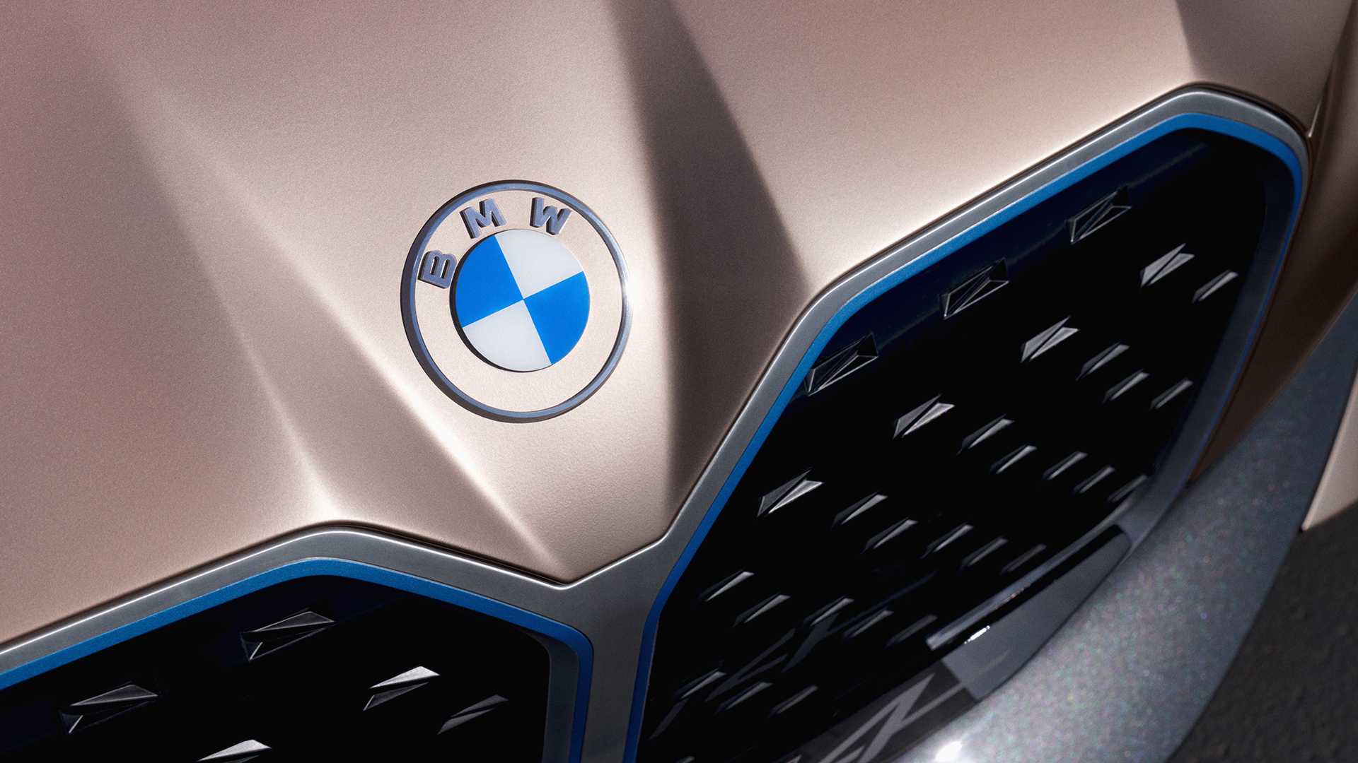
BMW said that the new logo will primarily be used for communication purposes and not be impressed upon its vehicles. However, images of the new logo have appeared on some special edition models like the i4 concept EV, hinting to the possibility that the new logo might be used on the vehicles themselves.
Overall, the new logo is being received with mixed reviews by auto journalists and design experts. Some say that the logo is confusing, pointing out the absence of the black ring that surrounds the entire circumference of the logo. Others say that the minimalist approach works, providing a really clean look that works well for the brand.
“With visual restraint and graphic flexibility, we are equipping ourselves for the vast variety of touchpoints in communication at which BMW will be present, online and offline, in the future,” said Thiemer. “This additional communication logo symbolizes the brand’s significance and relevance for mobility and driving pleasure in the future.”
This is the sixth time in 103 years that BMW has modified its logo. The last time it was updated was in 1997.